Charts · Chart Settings
TradingView Chart Settings: Background, Grid, Candles, and Scales
Many people rush to add indicators, draw trend lines, and hunt for tools that look professional the first time they open TradingView—while skipping the most basic step: making the chart easy to read.
If the background is too dark, grid lines too heavy, candle colors unfamiliar, or scales too cluttered, the chart gets tiring fast. TradingView Chart Settings are not about making the screen flashy. They help price, candles, scales, grids, the status line, and annotations stand out clearly.
Getting the chart clear comes before stacking on indicators.
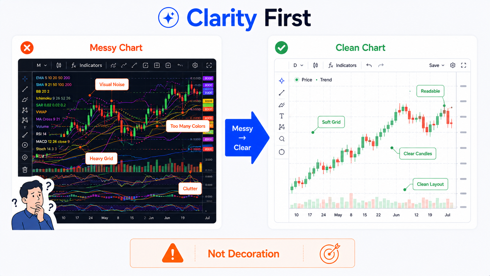
Bottom line first: chart settings are for clarity, not decoration
The core job of TradingView chart settings is not to make the screen look cool or to build a complex color palette.
They should solve questions like:
- Can you tell up and down candles at a glance?
- Is the current price position obvious?
- Are the scales easy to read?
- Do grid lines distract from price?
- Is the background comfortable over long sessions?
- Are screenshots clear enough to share?
- Do tutorial images help readers follow the point?
- Does the status line show what you need?
- Have you hidden information that should stay private?
A chart is not better because it looks flashy. What matters is whether you can read it reliably.
If a chart looks impressive but you cannot find the price story, it is not a good setup.
Where do you open TradingView Chart Settings?
On a chart page at the TradingView website, you can usually open Chart Settings in several ways.
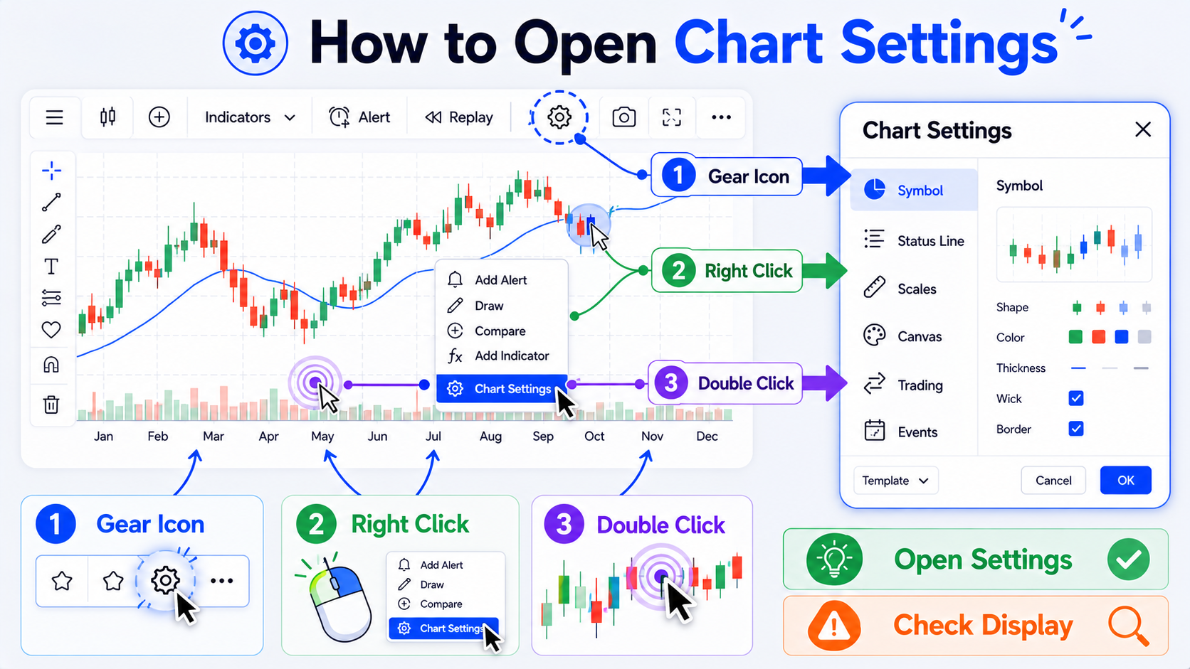
1. Click the gear icon on the chart
This is the most direct route.
Look near the lower-right of the chart or in the top toolbar for a gear-style settings button. Click it to open the chart settings window.
2. Right-click the chart area
Right-click empty chart space and you will often see Settings or a related option.
This is handy when you are already focused on the chart and do not want to hunt for a toolbar button.
3. Double-click a price line or candle
In some cases, double-clicking a price line, candle, or chart element opens the relevant settings panel.
For example, if you want to adjust candle style, colors, or chart-type options for the current symbol, double-clicking the main chart area can be faster.
4. Open settings from a layout or template
If you have saved a chart layout, you can adjust settings for individual charts within it. In multi-chart layouts, some settings apply per chart; others can propagate across charts in the same layout.
Beginners can remember one rule:
If you cannot find settings, try the gear icon first, then right-click the chart.
What is inside the chart settings window?
TradingView chart settings are usually grouped by function. Names may vary slightly by version or language, but the logic is similar:
| Settings area | Main purpose |
|---|---|
| Symbol | Candlesticks, bars, line chart, and other price display styles |
| Status line | Which information appears at the top of the chart |
| Scales and lines | Price scale, time scale, current price line, and related lines |
| Canvas | Background, grid lines, buttons, margins, and canvas effects |
| Trading | Trading buttons and order display |
| Events | Earnings, dividends, splits, and other event markers |
| Alerts | Alert-related display elements |
You do not need to study every option on day one.
Start with these priorities:
- Background color;
- Candle colors;
- Grid lines;
- Scales;
- Status line;
- Event and trading display;
- Privacy before screenshots.
How do you set background color?
Background color is usually under Canvas or Appearance settings. The exact label may differ by version, but the idea is the same: choose dark, light, gradient, or custom backgrounds.
Background color is a readability choice—not just an aesthetic one.
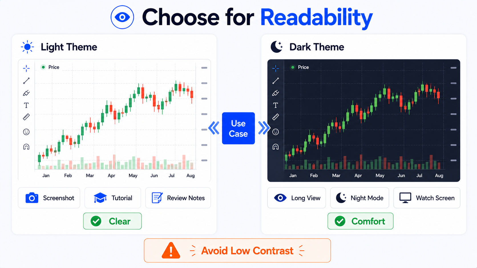
When is a light background a good fit?
Light backgrounds work well for:
- Writing tutorials;
- Website images;
- Screenshots for others;
- Printing or note-taking;
- Long-form articles with charts;
- Any case where readers need to see candles and labels quickly.
Advantages of a light background:
- Text and annotations are easier to read;
- Screenshots look cleaner in articles;
- They blend better on light web pages;
- They reuse well across multilingual tutorial images.
One caution: do not make grid lines too strong, or the chart starts to look like a spreadsheet.
When is a dark background a good fit?
Dark backgrounds work well for:
- Long screen-watching sessions;
- Night use;
- Users who prefer low-brightness interfaces;
- Dim room lighting;
- Matching other dark trading dashboards.
Advantages of a dark background:
- Often less glare over long sessions;
- Strong color contrast;
- Works well when monitoring multiple charts.
But dark screenshots can look heavy on a white article page. If you run a tutorial site or publish images in posts, light charts usually blend better.
What should beginners choose?
If you mainly watch markets yourself, try dark mode.
If you mainly write tutorials, take screenshots, review trades, or build images, start with a clean light theme.
Most important:
The background should make price clearer—not compete with price for attention.
How do you set candle colors and styles?
Candle colors are usually under Symbol settings. There you can adjust up candles, down candles, borders, wicks, and related elements.
Many beginners make candles colorful—and then find the chart harder to read.
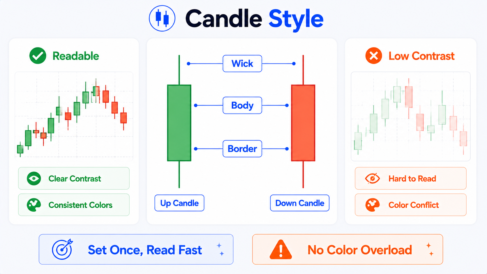
Up and down candle colors
Common habits include:
- Up candles: green or red;
- Down candles: red or green.
Color conventions differ by region. Some markets use red for up and green for down; many international charts use green up and red down.
Do not worry about which is “correct.” Pick one scheme and stick with it.
Suggestions:
- Fix one color pair and avoid frequent changes;
- Keep strong contrast between up and down;
- Avoid colors that are too similar;
- Skip harsh, oversaturated tones.
Body, border, and wicks
A candle usually includes:
- Body;
- Border;
- Upper wick;
- Lower wick.
If body, border, and wicks are all loud colors, the chart gets noisy.
A clearer approach:
- Make the body easy to see;
- Keep wicks slightly subdued;
- Do not over-emphasize borders;
- Maintain enough contrast against the background.
That makes price structure easier to follow.
Hollow vs solid candles
Some users prefer hollow candles because they highlight close vs open more finely; others prefer solid candles because they feel more direct.
Beginners should start with the most common solid candlestick style, then try hollow styles once they are comfortable.
When is a line chart a good fit?
A line chart shows only a connected price line—usually better for the overall trend outline.
It suits:
- Long-term trend viewing;
- Clean presentations;
- Reducing short-term noise;
- Explaining direction to beginners.
But a line chart hides open, high, low, and other detail—not ideal for every analysis task.
When is a bar chart a good fit?
Bar charts are simpler than candles but can be less intuitive for beginners.
If you are new to TradingView, start with candlesticks. Compare bars, lines, and other chart types after you are comfortable reading price structure.
How do you set grid lines?
Grid lines are an easy detail to overlook on TradingView charts.
If grids are too strong, they pull attention away from price.
If they are too faint, it is harder to judge price and time positions.
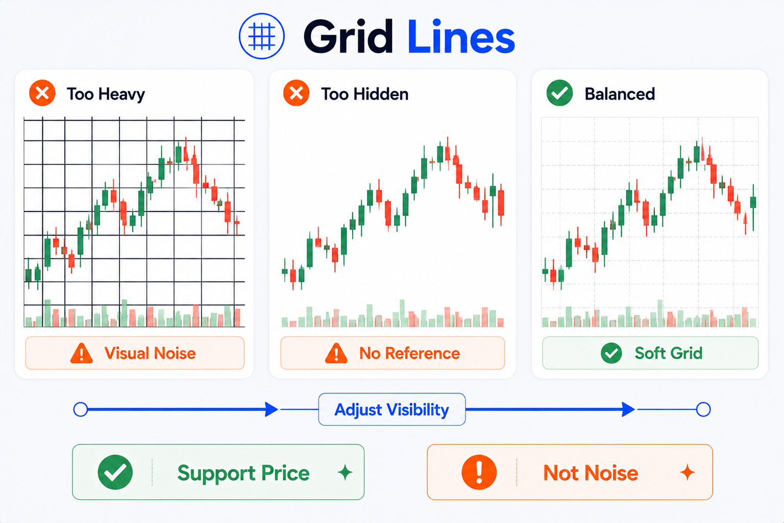
Should you keep grid lines?
Yes— but keep them light.
Grids help you roughly align:
- Time;
- Price;
- Candle positions;
- Annotation areas.
They should not be the main visual element.
Beginner suggestions
Try settings like these:
- Horizontal grid lines: keep, but fade the color;
- Vertical grid lines: keep or fade further;
- Grid opacity: lower it;
- Grid color: light or dark gray close to the background;
- Avoid bright, thick, or dense grids.
A good chart should show price first—not grid lines first.
How do you set scales and separator lines?
Scale-related elements include:
- Right-hand price scale;
- Bottom time scale;
- Current price line;
- Previous close line;
- High/low labels;
- Bid/ask lines;
- Countdown;
- Separator lines.
Each can be useful—but turning everything on makes the chart crowded.
Price scale
The price scale should be clear without shouting.
Suggestions:
- Keep the right-hand price scale;
- Use a moderate text size;
- Ensure enough contrast with the background;
- Avoid stacking too many indicator scales.
If you add many indicators, each with its own scale, the chart can get messy. Consider hiding some indicator scales or moving indicators to separate panes.
Current price line
The current price line helps you locate the latest price quickly.
Keep it—but do not make the color harsh.
In tutorials and screenshots, it helps readers see where the chart stands now.
Bid/ask lines and trading-related lines
If you connect a brokerage account or enable trading display, the chart may show bid/ask prices, orders, positions, trading buttons, and similar elements.
Those help live trading but can clutter tutorial screenshots—and may expose private information.
Before sharing publicly, check whether you are showing:
- Account-related information;
- Order lines;
- Open positions;
- Trading buttons;
- Connected account status.
Separator lines and date/time markers
Separators can mark sessions, weeks, months, or other time blocks.
If they are too strong, the chart looks chopped into fragments.
Keep only the separators you need and lower their color intensity.
How should you tune the chart canvas?
Canvas settings are the “base layer” of the chart.
They affect:
- Background style;
- Background color;
- Grids;
- Canvas margins;
- Button display;
- Price scale text size;
- Overall visual density.
Margins
Reasonable margins give the right price scale, labels, and future space room to breathe.
If candles sit flush against the right edge, the chart feels cramped.
Leave some space on the right—especially when you:
- Review trades;
- Draw trend lines;
- Add text notes;
- Capture tutorial screenshots;
- Watch space for upcoming candles.
Button display
The chart may show many small buttons:
- Indicator settings;
- Add alert;
- Trade;
- Zoom;
- Quick tool shortcuts.
Keep useful buttons during daily use.
Hide unneeded buttons for screenshots or tutorial images to reduce visual noise.
Do not overfill the canvas
Many beginners cram the chart with:
- Multiple indicators;
- Several moving averages;
- Many annotations;
- Dense grids;
- Loud backgrounds;
- Trading lines;
- Alert lines;
- Buy/sell markers.
The result looks “professional”—but the price story disappears.
Good canvas settings let the main information stand out instead of pushing every element into the reader’s face.
How do you set the status line and on-chart information?
The status line controls what appears at the top of the chart.
Common items include:
- Symbol name;
- Open, high, low, close;
- Change percentage;
- Indicator values;
- Exchange information;
- Chart interval;
- Data status.
The status line is useful—but more is not always better.
When you are watching charts yourself
You can keep:
- Symbol;
- Timeframe;
- OHLC;
- Change percentage;
- Key indicator values.
That lets you confirm chart context quickly.
When you screenshot or share publicly
Be extra careful.
Check whether you are showing:
- Account information;
- Connected brokerage status;
- Orders or positions;
- Custom indicator names;
- Private template names;
- Watchlist or layout names you do not want public;
- Personal notes.
When writing tutorials or posting publicly, the status line, side lists, and bottom panels sometimes expose unrelated information.
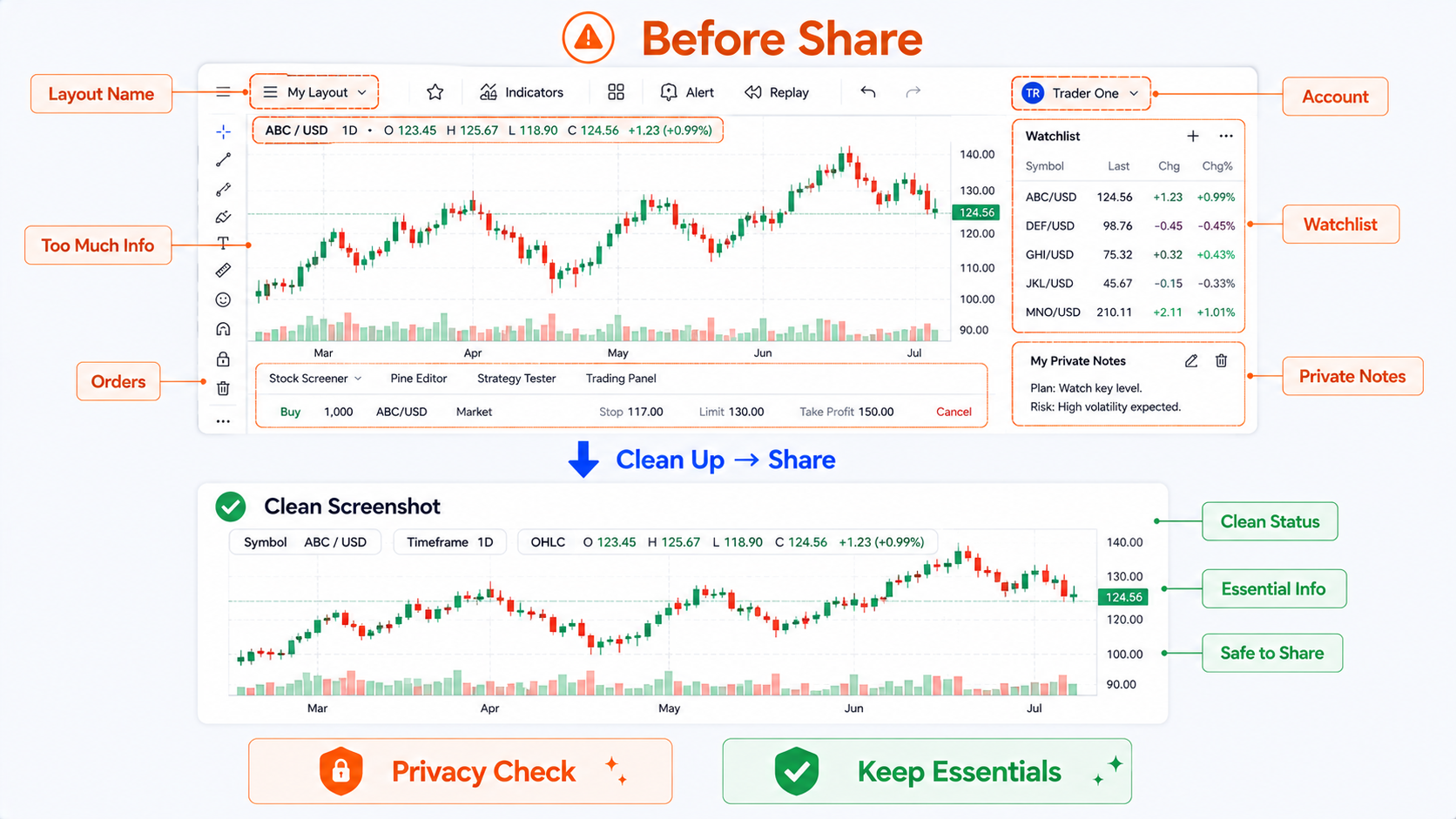
Before a screenshot, do a quick “clean screen” pass:
- Close the trading panel;
- Hide unneeded indicators;
- Hide orders and positions;
- Collapse unrelated sidebars;
- Confirm no private information remains;
- Keep what readers need to see.
Three chart styles that work well for beginners
Below are three starting points—not fixed templates. Adjust them to your habits.
| Style | Best for | Background | Candles | Grid | Status line |
|---|---|---|---|---|---|
| Clean light chart | Tutorials, screenshots, review notes | Light or white | Green up / red down or red up / green down—pick one | Very faint | Symbol, interval, OHLC only |
| Dark watchlist chart | Long sessions, night use | Dark gray or black | High contrast, not harsh | Low brightness | Keep common data fields |
| Review and annotation chart | Trade review, teaching, trend-line markup | Light or soft dark | Clear contrast | Very faint or horizontal only | Hide noise; highlight annotations |
Clean light chart
Best for writing, tutorials, and screenshots.
Traits:
- Clean background;
- Clear candles;
- Very light grids;
- Uncrowded annotations;
- Images that sit well on web pages.
If you run a tutorial site or multilingual articles, this is the most practical default.
Dark watchlist chart
Best for long personal screen time.
Traits:
- Low brightness;
- Clear contrast;
- Less eye strain over time;
- Visual consistency across multi-chart layouts.
When sharing screenshots, note that dark images can look heavy on light pages.
Review and annotation chart
Best for trade review, course material, or strategy notes.
Traits:
- Simple background;
- Weakened grids;
- Space on the right;
- Consistent annotation colors;
- Few indicators;
- Clean status line and sidebars.
The goal is not beauty—it is making your point obvious at a glance.
Common beginner mistakes
Mistake 1: Too many loud colors
Some people set strong colors for background, candles, moving averages, indicators, and annotations.
It looks “pro” at first—and gets tiring fast.
The more colors compete, the harder it is to see what matters.
Limit your palette:
- One candle color pair;
- One or two key moving-average colors;
- Fixed annotation colors;
- One consistent color for risk or alerts;
- Not every element fighting for attention.
Mistake 2: Weak contrast
Some charts use backgrounds too close to candle colors, or up/down candles too similar.
You end up squinting to read price.
A good chart should not require effort just to see structure.
Mistake 3: Grid lines too heavy
Grids are helpers—not the star of the chart.
If grids stand out more than candles, readers see lines before price.
Fade grids—or in tutorial images, keep only essential scale marks.
Mistake 4: Screenshots that leak information
Before public screenshots, check for:
- Account information;
- Trading lines;
- Positions;
- Orders;
- Private watchlists;
- Custom indicator names;
- Browser tabs;
- Personal notes;
- Unpublished strategy names.
Many people focus on candles and forget what surrounds the chart.
Mistake 5: Treating styling as analysis skill
This is easy to overlook.
A pretty chart does not mean better analysis.
Colors, backgrounds, grids, and candle styles improve readability—not prediction.
Chart settings serve observation—not fantasy.
“Professional colors” do not improve trading outcomes.
At best, they reduce noise so you can read the chart more steadily.
A setup workflow beginners can follow
If you are not sure where to start, adjust in this order:
- Choose a light or dark background;
- Set your preferred up and down candle colors;
- Lighten grid lines;
- Keep the right-hand price scale;
- Keep the current price line;
- Show only necessary status line fields;
- Turn off unneeded trading lines and buttons;
- Leave a little space on the right;
- Save as a layout or template;
- Recheck privacy before screenshots.
This flow is simple—and often makes charts much clearer.
Extra tips for tutorial images
If you use TradingView charts in article images, keep a few more things in mind:
1. Do not overload indicators
Tutorial images usually need one main point.
If you explain candle colors, do not add five indicators at once.
2. Keep on-chart text minimal
More text on the chart makes multilingual reuse harder.
Use short English labels on the chart; put detailed explanation in the article body.
3. Avoid real sensitive information
Do not show:
- Personal accounts;
- Real orders;
- Positions;
- Private watchlists;
- Private notes;
- Unpublished strategies;
- Specific buy/sell conclusions.
4. Keep chart themes consistent
On one site, tutorial charts should share a visual style.
For example:
- Same background;
- Same candle colors;
- Same annotation colors;
- Same font and margins;
- Same risk-callout styling.
Readers perceive the site as more polished—and remember the look more easily.
Summary: chart settings should serve observation
TradingView Chart Settings are basic functionality every beginner should learn early.
They help you adjust:
- Background color;
- Candle style;
- Up and down candle colors;
- Borders and wicks;
- Grid lines;
- Scales;
- Current price line;
- Status line;
- Chart canvas;
- Event and trading display.
But the goal is not showmanship—or a movie-trader screen aesthetic.
Good chart settings help you read steadily:
- Where price is;
- How candles are moving;
- How to read the scales;
- Which information matters;
- Which elements to hide;
- Whether readers can follow a screenshot.
See clearly first—then analyze.
This article covers only the basics of TradingView chart settings, background color, candle color, grid lines, and chart styling. It does not provide investment advice, link chart appearance to trading results, or promise any returns.
FAQ
Where do you open TradingView Chart Settings?
You can click the gear icon on the chart, right-click the chart area and choose Settings, or double-click a price line or candle to open related settings. Exact placement may vary slightly by version, but the gear button and right-click menu are the most common entry points.
Is a dark or light background better on TradingView?
Dark backgrounds suit long screen sessions and night use. Light backgrounds suit screenshots, tutorials, review notes, and web articles. Neither is universally better—the background should not distract from price.
How should you set candle colors for clarity?
Pick one fixed up/down color scheme and keep strong contrast between bullish and bearish candles. Make the body easy to read; keep wicks and borders subtle. Avoid changing colors often so your reading habit stays stable.
Should you turn off grid lines on TradingView?
You do not have to turn them off. Grid lines help align price and time, but they should be faint. Heavy grids distract from candles—especially in screenshots and tutorials—so lower their opacity and intensity.
Do chart settings affect trading results?
No. Chart settings only improve readability. They do not improve forecast accuracy or guarantee returns. A clear chart reduces visual noise, but outcomes still depend on your research, risk control, and judgment.